


Navigation card default
Clickable cards give users a brief summary of content with a link to more detail

Body text can be strong for emphasis and contain links lorem ipsum dolor sit amet, consectetur adipiscing elit egestas luctus lectus dignissim tristique.
Body text tighter can be strong for emphasis and contain links lorem ipsum dolor sit amet, consectetur adipiscing elit egestas luctus lectus dignissim tristique.
Navy
#001529
Grey 1
#334454
Grey 2
#596774
Grey 3
#939ea8
Grey 4
#c9ced3
Grey 5
#f4f5f6
White
#ffffff
Purple 1
#271ca2
Purple 2
#4133dc
Purple 3
#b9b2ff
Purple 4
#e7e5ff
Green 1
#00998f
Green 2
#30f2e6
Green 3
#ccfffc
Red
#cc2929
Pink
#fff2f2
| Token | Mobile | Desktop |
|---|---|---|
| section-padding-top | 48px | 64px |
| section-padding-bottom | 64px | 80px |
| reading-width | 592px | 696px |
| max-width | 1280px | 1280px |
| margins | 16px | 32px |
| gutters | 16px | 32px |
| Spacer 0 | 0 | 0 |
| Spacer 1 | 4px | 4px |
| Spacer 2 | 8px | 8px |
| Spacer 3 | 12px | 16px |
| Spacer 4 | 16px | 24px |
| Spacer 5 | 24px | 32px |
| Spacer 6 | 32px | 40px |
| Spacer 7 | 40px | 48px |
| Spacer 8 | 48px | 56px |
| Spacer 9 | 56px | 64px |
| Spacer 10 | 64px | 80px |

Accordions make content easier to digest by letting users reveal more detailed information only if they need it. They can contain paragraphs and lists.
Accordions make content easier to digest by letting users reveal more detailed information only if they need it. They can contain paragraphs and lists.
Clickable cards give users a brief summary of content with a link to more detail
Clickable cards give users a brief summary of content with a link to more detail
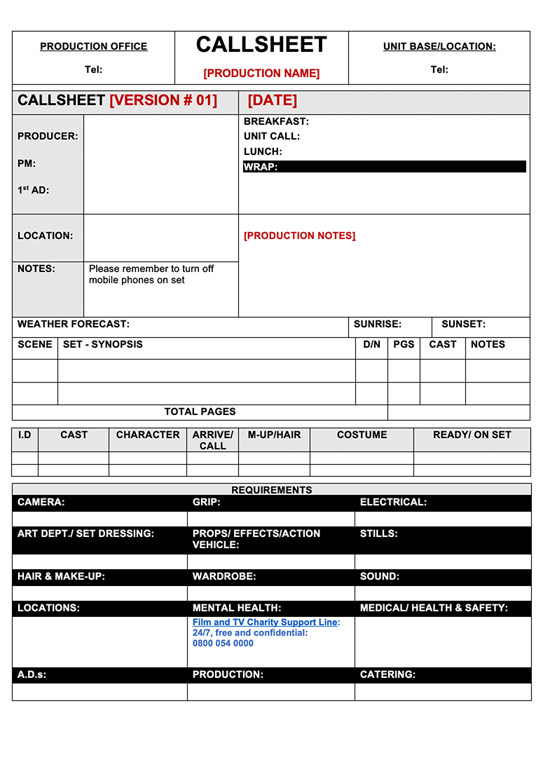
Use when more context is needed for files the user needs to download such as a template or worksheet.

If a cover image is not supplied the thumbnail will fall back to a default icon.
Highlights helps users identify and understand important content on the page. They can contain paragraphs and lists. Use highlight text sparingly; it’s less effective if overused.
The last element does not have margin-bottom.
 Image caption is optional and used to convey additional information that is either not present or tangentially related to the picture. Image: Optional attribution
Pictogram list
Each item in a pictogram list is illustrated with a supporting pictogram.

Pictogram list
List items can be preceded by a bold heading.

The text of each list item can be strong for emphasis and contain links.

Ticked lists can be used to reinforce a series of positive items, like a set of ‘dos and don’ts’.
The text of each list item can be strong for emphasis and contain links.
Here’s another ticked list item.
“Blockquotes are unique content quoted from another source. Opening and closing quotation marks are generated automatically.”
Quote attribution
£8.8m
large statistic
0.123%
large statistic
888,888
large statistic
| Column A | Column B |
|---|---|
| Cell A1 | Cell B1 |
| Cell A2 | Cell B2 |
| Cell A3 | Cell B3 |
| Column A | Column B | Column C |
|---|---|---|
| Cell A1 | Cell B1 | Cell C1 |
| Cell A2 | Cell B2 | Cell C2 |
| Cell A3 | Cell B3 | Cell C3 |
Transcript text is shown here when the disclosure is opened.


Standfirst is a short, plain-text sentence used to summarise the content, connect the headline to the main text and hook the reader

Introductory paragraph is optional, with the choice of either photo or video background.
Call to actionStandfirst is a short, plain-text sentence used to summarise the content, connect the headline to the main text and hook the reader

Display a grid of logos, with optional introductory paragraph and call to action.
Call to action








Testimonial with a full-width quote lorem ipsum dolor sit amet, consectetur adipiscing elit egestas luctus lectus
Source, description lorem ipsum

An error summary is shown at the top of a page to summarise any mistakes a user has made. Errors in the summary are anchor-linked to the question they relate to. Explain what went wrong and how to fix it, repeating the same error message wording next to the inputs.
File uploadLet users select and upload a file.
No file chosenHint text gives users help in context, like how to answer a question or how their data will be used.
Hint text gives users help in context, like how to answer a question or how their data will be used.
 Explain what went wrong and how to fix it
You have 123 characters remaining

X out of Y actions completed
 URL copied to clipboard
Error message
Use this link to return to your plan at any time, or download your action plan as a PDF.
URL copied to clipboard
 Download your action planPDF | XXX KB
